NDIS Stats Dashboard Mar 2025
Using the Dashboard
This dashboard contains participant, provider and participant plan utilisation data published by NDIS as at September 2020. We have collated the published data to allow you to more easily see where participants and providers are concentrated, along with which areas are the most underserved, as well as which geographic locations participants are not fully utilising their plans. Providers can be registered under several registration groups, so use the Support Class filter to see the areas that your organisation operates in.
The Interactive dashboard allows you to click to select elements, which will filter the rest of the dashboard. You can use the filters on the top to filter the data on the dashboard based on your target market – you can hold CTRL on your keyboard to select multiple options – remember to unselect the “ALL” option to ensure the filter is applied.
You can also click on any of the chart elements on the bottom row to filter the dashboard based on your selection. You can hold CTRL here as well to select multiple options. In the example below, we have selected ACT to just see the data related to ACT.
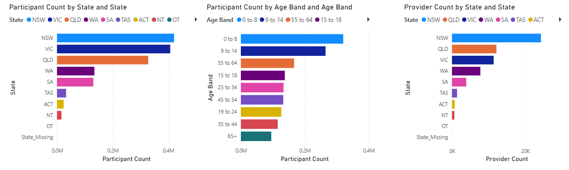
This will update stats at the top of the page based on your selection.
